
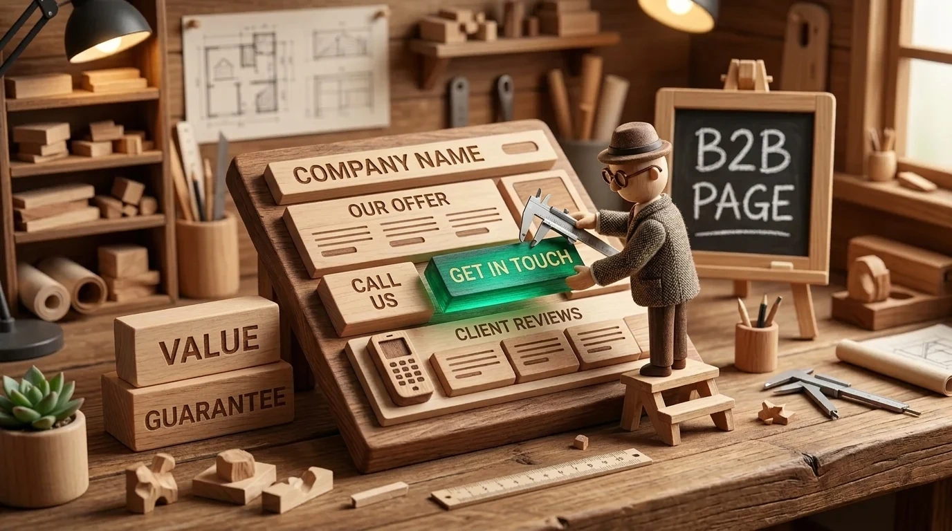
Principles for high-conversion B2B pages have become even more precise since 2024. In 2026, the decision to trust is made within the first 50 milliseconds, where instant loading, mobile ergonomics, and removing post-click anxiety with micro-reassurance are mandatory standards. Learn more in our landing page development services.
In B2B marketing, the biggest waste of budget occurs not because of incorrect keywords or poor ad banners, but the moment an interested visitor lands on the company website. If an ad campaign promises a specific solution, but the user is sent to a generic homepage or a heavy corporate section with 20 menu items, they will simply close the tab. A targeted landing page, tailored to a specific offer, is the most powerful tool for converting ad spend into real business leads.
Key Takeaways
- The first 5 seconds decide everything: A B2B decision-maker must immediately understand: what business problem you solve, what the specific benefit is, and what the first step is.
- Trust bar right below the Hero: International certificates (ISO, GDPR), recognizable client logos, and industry awards reduce visitor skepticism in the very first screen.
- Correlation between form length and friction: Every unnecessary input field reduces the completion rate by 10%; in the B2B sector, a name, work email, and project goal are sufficient.
- The principle of one specific Call to Action (CTA): Do not overwhelm the user with multiple conflicting choices; offer one clear primary action.
The Anatomy of an Effective B2B Landing Page
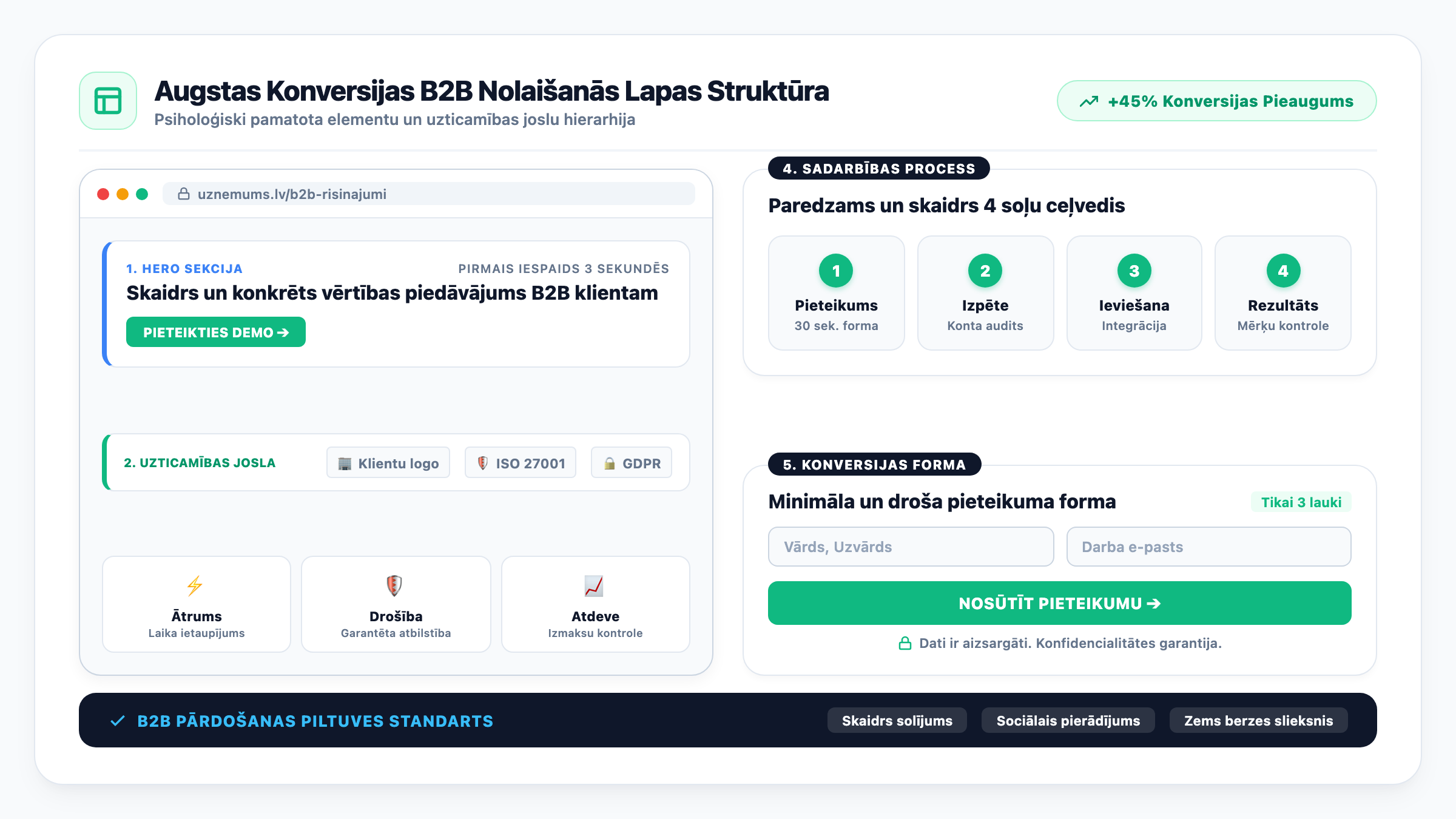
A successful B2B page is not a random design experiment, but a carefully calculated psychological structure. The visitor must be guided through specific stages of perception:
1. Hero section with a clear value proposition: The main headline defines the result, the sub-headline explains how it is achieved, and a bright, contrasting button invites the first step (e.g., 'Request a Demo' or 'Get an Audit Plan').
2. Trust Bar: Immediately below the first screen, place recognizable client logos, partner brands, or security certificates (ISO 27001, GDPR compliance). This provides social proof before the reader delves into details.
3. Three pillars of value: Instead of listing 20 technical features, formulate 3 main business benefits: time savings, cost reduction, or error risk mitigation.
4. Collaboration process in 4 simple steps: Show that the collaboration will be predictable and professional: Application -> Research -> Implementation -> Result Monitoring.
5. Simplified application form: A minimal number of fields with a guarantee of data confidentiality.
Comparison: Weak Landing Page vs. Optimized B2B Model
Small changes in structure and text can create a dramatic difference in conversions:
| Element | Typical Weak Approach | Optimized B2B Model | Business Result |
|---|---|---|---|
| Main Headline | We are a leading industry company since 2008 | Reduce server downtime risk and accelerate IT processes by 40% | User immediately sees their benefit |
| Navigation | Full site header with 10 links to other sections | Removed unnecessary navigation, focus only on the offer | No distractions or traffic leakage |
| Form Fields | 9 fields, including company reg. no. and address | 3 essential fields: Name, Work Email, and Phone | Conversion increase of 80 to 120% |
| Social Proof | Generic text 'Clients love us' | Specific testimonials with job titles and achieved metrics | Instant sense of authority |
| Thank You Page | Simple 'Thank you' message | Clear timeframe for contact and link to useful material | Client does not leave to search for competitors |
Creating such pages requires professional B2B landing page development that combines UX design with marketing psychology.
Synergy of Text and Visual Design
A B2B buyer is a busy person. They do not read long paragraphs of prose, but 'scan' the page with their eyes. Therefore, text structure is of huge importance:
Strong headlines and sub-headlines: Each block must be understandable even if the reader only reads the headlines. Well-thought-out website copy and content guide the reader from problem awareness to readiness to act.
Modern and fast code foundation: If a page on a mobile phone loads slower than 2 seconds, 50% of buyers will leave before seeing the content. This is where code modernization and transition to lightweight technologies help.
As we explained in our study on how customer reviews influence ad effectiveness, trust signals are the primary catalyst for decision-making.
Frequently Asked Questions
Does one landing page fit all services?
No! The narrower and more specific the offer is for a particular audience, the higher the conversion will be. It is better to create 3 targeted pages for different services than one generic one.
How to prevent spam if the form has only 3 fields?
Use invisible Google reCAPTCHA v3 or Cloudflare Turnstile, which analyze user behavior without annoying image puzzles.
Should a landing page be indexable in Google search?
If the page is created only for specific ad campaigns with a narrow offer, it is often left with a 'noindex' tag so it does not duplicate main service pages. However, if it is a general service page, it can be fully optimized for SEO searches as well.
Conclusions
An effective B2B landing page is not a luxury, but the most efficient way to increase advertising ROI. By implementing a clear value proposition, removing unnecessary bureaucracy in forms, and demonstrating genuine trustworthiness, a company ensures a steady flow of clients.
Want a landing page that consistently turns ad clicks into real client leads?
Request a 15-minute consultation. We will develop an ergonomic B2B page with a clear value proposition and low friction.
Fixed budget. No hidden fees or forced services.