
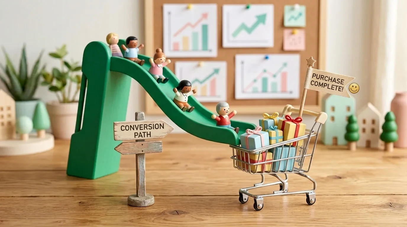
Conversion Rate Optimization (CRO) in 2026 has evolved into a discipline of neuro-design and speed: the 3-second test, the mobile "golden thumb" zone, the Doherty threshold (response times under 400ms), and low-stress interactive calculators have replaced long, cluttered contact forms. See our approach to high-converting landing page development.
Many companies allocate the majority of their marketing budget to attracting visitors via Google Ads, social media, and SEO. However, once a visitor arrives at the website, they are met with slow loading speeds, unclear messaging, and complex application forms. As a result, only 1-2% of visitors make a purchase or submit an inquiry. Conversion Rate Optimization (CRO) is a systematic process that allows you to double your sales from your existing traffic without paying a single cent more for ad clicks.
Key Takeaways
- The Three-Second Rule: Within the first three seconds, a visitor must clearly understand what the company offers, what problem it solves, and what the next step is.
- Eliminating Friction: Every unnecessary field in an application form and every second of slow loading time reduces completed orders by 7-15%.
- Social Proof and Trust: Real customer reviews, partner logos, and industry certifications significantly reduce buyer hesitation at the moment of decision.
- One Primary Action (Primary CTA): Page elements should not compete with one another; every screen must be focused on one clear call to action.
How to build a conversion path from first impression to purchase
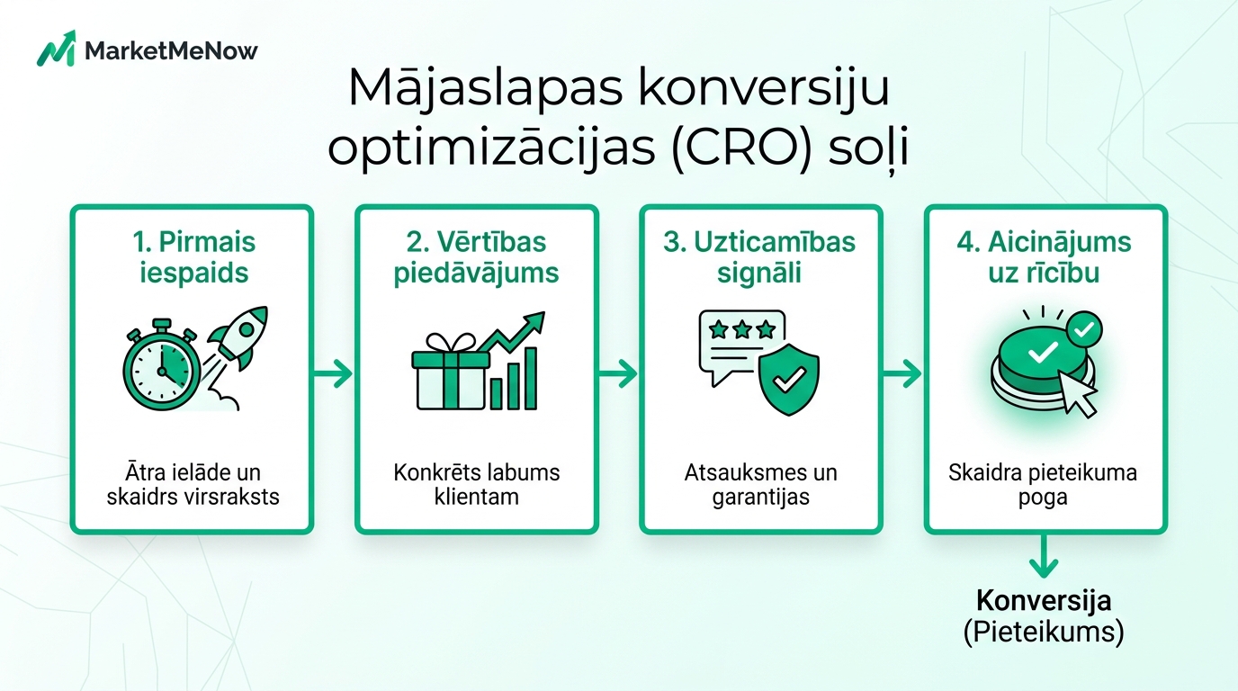
The user decision-making process on a website is not random - it follows specific psychological and visual patterns. If a website is organized in a logical sequence, the visitor naturally moves through the sales funnel:
Critical design elements that directly impact sales
1. Headline and Value Proposition. Avoid abstract slogans like "Quality and reliability since 2010." Formulate a concrete benefit: "Web development that attracts new clients and loads in under a second."
2. Contrasting and Clear CTA (Call-to-Action) Button. The main button ("Request a consultation," "Buy now") must visually stand out from the background and be clearly visible without searching. Ensure the text on the button expresses a specific benefit.
3. Social Proof in the Decision Zone. Place customer reviews, photos of real people, star ratings from your Google Business profile, and logos of well-known brands right next to the order form.
4. Minimizing Form Fields. Ask only for critically necessary information: name and phone number or email. Additional details regarding company registration codes or addresses can be clarified later during the conversation.
Video analysis of common conversion mistakes
To understand why many visually appealing websites fail to sell and how to fix it, watch this explanation from the experts at Exposure Ninja:
Mobile usability as the key to success
More than 70% of all web traffic in Latvia comes from smartphones. If the text on the mobile version is too small, buttons are too close together, or pop-ups cover the entire screen, the user will immediately return to the search engine.
Thoughtful mobile navigation with a fixed contact button at the bottom of the screen often provides an immediate conversion jump of 20-30%. If you want to modernize your site and achieve maximum return from every visitor, explore our web development and audit services.
Frequently Asked Questions about conversion optimization
What is a good website conversion rate?
How can I best check where users are leaving my website?
Does a design change always improve conversions?
Want to turn website visitors into real client inquiries and sales?
Request a 15-minute CRO consultation. We will discuss your website structure, speed, and conversion funnel.
Fixed budget. No hidden fees or forced services.