

A historical March 2021 guide on the completion of Google's transition to mobile-first indexing. Today, mobile ergonomics, thumb zone principles, and sub-400ms loading speeds dictate both user trust and search engine positions. Learn how we build custom websites in our web development service.
Key Takeaways
- The Unified Mobile Reality: Google officially transitioned to 100% mobile-first indexing, meaning the search bot looks exclusively at your website smartphone version.
- Disappearing Content: If any text, image, internal link, or structured data is visible on desktop but hidden on mobile, Google completely ignores it and excludes it from rankings.
- Technical Parity: Mobile and desktop versions must be identical in content, headings (H1-H6), metadata, and structured data.
- Business Impact: Slow mobile loading speeds and poor design not only drive buyers away but also permanently drop website positions in search results.
For years, Google warned website owners about the inevitable shift to mobile-first indexing. The spring of 2021 marked the culmination and final phase of this process. This represents one crucial paradigm shift: the desktop version no longer exists as an independent ranking factor in the eyes of the search bot. Everything Google uses to evaluate your website authority, relevance, and rankings is obtained by analyzing the page with a smartphone browser (Googlebot Smartphone).
For many companies in Latvia, this remains a painful realization. It is still common practice to develop websites and test content on large office monitors, while the actual customer and Google bot open the page on a mobile phone. If these two worlds do not match, the business loses both visitors and search positions.
What Exactly is Mobile-First Indexing and What Does It Mean?
It is important to distinguish between two things: mobile-friendly design and mobile-first indexing:
- Previous Model (Desktop-First): Googlebot first crawled the desktop version and determined the baseline score. If the site had a good mobile version, it received an additional bonus in mobile searches.
- New Model (Mobile-First): Googlebot Smartphone is the primary and only base scanner. If content or internal links do not appear in the mobile version, they are not indexed even if the user searches from a desktop computer.
This means that the old approach - "let us hide this long text block or menu section in the mobile version so the page looks shorter" - is a direct path to losing SEO rankings today. If text is hidden from the code or does not load in the mobile version, Google considers it non-existent.
Common Mistakes That Drag Rankings Down
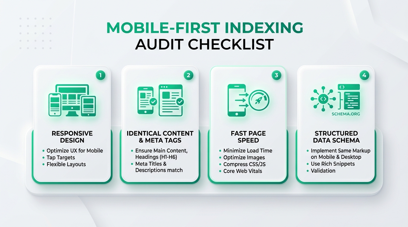
In our practice analyzing company websites, we most frequently encounter four critical discrepancies between desktop and mobile versions:
- Different Content Volume and Headings: The desktop version contains a full service description with H2 and H3 subheadings, while the mobile version leaves only a short summary and a button. As a result, Googlebot misses keywords and semantic explanations.
- Unlinked or Missing Structured Data (Schema Markup): Organization, service, or e-commerce product structured data is entered on the desktop version, but not output in the mobile template. Google strictly requires identical markup on both versions.
- Too Small Tap Targets: Buttons, navigation links, and phone numbers are placed so close together that it is impossible to tap accurately with a finger. This creates errors in Search Console reports and worsens usability metrics.
- Resource Blocking via robots.txt: Sometimes CSS styles or JavaScript files responsible for rendering the mobile page visually are mistakenly blocked in the
robots.txtfile. In this case, the search engine sees the page as broken and assigns it an improper score.
Official Google Search Central Video Guide
To understand the technical nuances from the perspective of Google engineers themselves, watch the official Google Search Central video session on mobile-first indexing and its requirements:
Technical Audit Comparison: Correct vs. Flawed Approach
Here is how a quality mobile approach differs from outdated solutions:
| Element Type | Outdated Approach (Error) | Modern Mobile-First Approach (Correct) | Benefit |
|---|---|---|---|
| Site Architecture | Separate m.domain.lv subdomain version | Unified responsive web design system | No URL duplication risks and redirect errors eliminated. |
| Content Parity | Showing less text on mobile to "save space" | Identical content with collapsible blocks (Accordions) | Google indexes 100% of all text and keywords. |
| Image Optimization | Massive original files scaled down with CSS | Modern WebP formats with precise `srcset` sizes | Mobile network loading time decreases by several seconds. |
| Internal Links | Simplified mobile menu with skipped categories | Full hierarchical navigation and breadcrumbs | Search bot and users easily find deep service pages. |
What to Do Right Now: 3 Priority Steps
If your website has not been reviewed within the past year, it is worth performing three checks immediately:
- Open Google Search Console "Mobile Usability": Check for red error notifications regarding elements placed too close together or content that overflows screen width.
- Test Real Page Speed on 4G Networks: Use PageSpeed Insights and pay attention specifically to the mobile tab. If the score is red, code optimization is required.
- Perform a Professional Audit: If you are planning a website redesign, ensure that the new web development is built from day one using a mobile-first principle. Simultaneously, order a technical SEO audit to identify hidden errors before they impact company revenue.
The mobile environment is no longer the future - it is the only search present. Take care of your website mobile health today so you do not lose clients tomorrow to competitors whose sites load instantly.
Frequently Asked Questions (FAQ)
Does Google still evaluate desktop searches separately?
No. Google maintains only a single unified search index. Even when a client searches for information from a powerful desktop computer in an office, the ranking algorithm uses the data and content it read from your website mobile version.
Is text hidden in accordions on mobile phones indexed?
Yes! If content resides in the HTML code and is hidden solely for better usability purposes (such as via accordions or tabs), Googlebot fully reads and indexes it with the exact same weight as open text. The main thing is to ensure content is not loaded with delayed Ajax only after a click.
How can I know if my website has already been migrated to mobile-first?
You can check this in Google Search Console under "Settings". There you will see an "Indexing crawler" line indicating "Googlebot smartphone", along with the exact date when the site was officially switched to mobile indexing.
Do I need a separate m.domain.lv solution?
No, developing a separate m-subdomain is considered an outdated practice today. The standard is a unified responsive website (Responsive Web Design), where the exact same HTML code dynamically adapts to any screen size using CSS media queries.
Is your website fully optimized for modern mobile users?
Book a 15-minute consultation. We will evaluate your website mobile ergonomics, speed, and conversion funnel efficiency.
Fixed budget. No hidden extra fees or forced services.