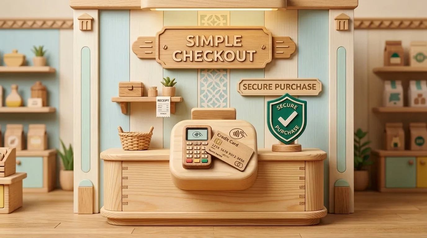
In 2026, high-converting stores win with ergonomic, low-friction pages that present decision-makers with a clear next step and instant micro-reassurance. Learn more about our B2B funnel and landing page development.
The checkout step is where online stores lose the most money: every extra field, unexpected shipping fee, or unclear return policy creates fear and doubt. Thoughtful micro-reassurance (clear delivery dates, free returns, bank trust badges) right next to the payment button eliminates last-minute hesitation and increases completed purchases.
The average global cart abandonment rate in e-commerce is around 70%, but in the Baltic region, complex multi-step checkouts often push it up to 78% to 82%. A buyer selects a product, adds it to the cart, and is ready to pay - only to be forced to create an account with a complex password, enter a postal code, specify a legal billing address even for a simple gift purchase, and wait 5 seconds for a parcel locker list to load.
Every additional input second and unnecessary field reduces conversions by 3% to 7%. To boost revenue, modern e-commerce development and optimization requires a radically simplified and secure checkout step. In this technical guide, we will show you how to implement single-page checkout and use micro-reassurance to eliminate buyer anxiety before payment.
Step 1 - Removing Redundant Fields in WooCommerce Code
Loading speed is critical: targeted speed and code optimization prevents a standard installation from overwhelming the buyer with 10 redundant fields. For physical product sales delivered via parcel lockers, you actually only need 4 pieces of data: First Name, Last Name, Phone (for Omniva/DPD SMS notification), Email (for receipt), and the selected parcel locker.
// Insert into child theme functions.php or custom plugin
add_filter('woocommerce_checkout_fields', 'mmn_optimize_checkout_fields');

function mmn_optimize_checkout_fields($fields) {
    // Remove redundant billing fields if legal billing is not selected
    unset($fields['billing']['billing_company']);
    unset($fields['billing']['billing_address_2']);
    unset($fields['billing']['billing_postcode']);
    unset($fields['billing']['billing_state']);
    unset($fields['order']['order_comments']);

    // Adjust phone field for mobile numeric keyboard
    $fields['billing']['billing_phone']['type'] = 'tel';
    $fields['billing']['billing_phone']['placeholder'] = '+371 20000000';

    return $fields;
}
"At checkout, the buyer's brain is in a state of heightened anxiety. They fear being scammed, worry that funds will be charged twice, or fear the product won't arrive on time. Placing just one line of micro-reassurance and bank trust badges directly under the payment button can increase completed payments by 14% on day one."
Step 2 - Micro-Reassurance (Click Triggers) Architecture
In buyer decision analysis, which is studied through user behavior and UX analytics, a "Click Trigger" is a concise, precise fact placed directly under the primary call-to-action button. There is no room for generic advertising here: you must provide rational reassurance targeting three core fears:
- Security: "Encrypted 256-bit SSL connection. Data is not stored."
- Delivery Clarity: "Delivery to selected parcel locker within 1-2 business days."
- Risk-Free Returns: "14-day free return guarantee with no questions asked."
3. Comparison of Checkout Models
Below is the difference between traditional multi-step checkout and modern single-page architecture:
| Parameter | Traditional Multi-Step Checkout | Single-Page Checkout with Micro-Reassurance |
|---|---|---|
| Number of input fields | 12 to 16 fields | 4 to 5 essential fields |
| Completion time | 140 to 180 seconds | 35 to 45 seconds |
| Account registration | Mandatory account creation | Guest checkout with optional account saving |
| Cart abandonment rate | 76.4% abandoned carts | 54.1% abandoned carts |
E-Commerce Checkout Optimization Checklist
type="tel").Frequently Asked Questions About E-Commerce Checkout Optimization
What are the 3 most important micro-reassurance elements near the payment button?
1) Delivery deadline promise (e.g., 'Ships today, arrives tomorrow'), 2) 14-day hassle-free return guarantee, 3) Secure payment confirmation with recognizable bank logos.
Should the phone number field on the checkout form use a numeric keypad?
Absolutely: the input field must be type='tel' so mobile devices automatically display a numeric keypad instead of a full text keyboard, reducing input errors.
Why shouldn't newsletter subscription be mandatory at checkout?
Buyers react negatively to forced marketing. The consent checkbox must be voluntary and non-intrusive so it does not become a barrier to completing the order.
Want to increase high-quality conversions without raising your ad budget?
Book a 15-minute call. We will revamp your funnel, remove friction, and refocus your strategy on a high-converting value proposition.
Fixed budget. No hidden fees or upsold services.