
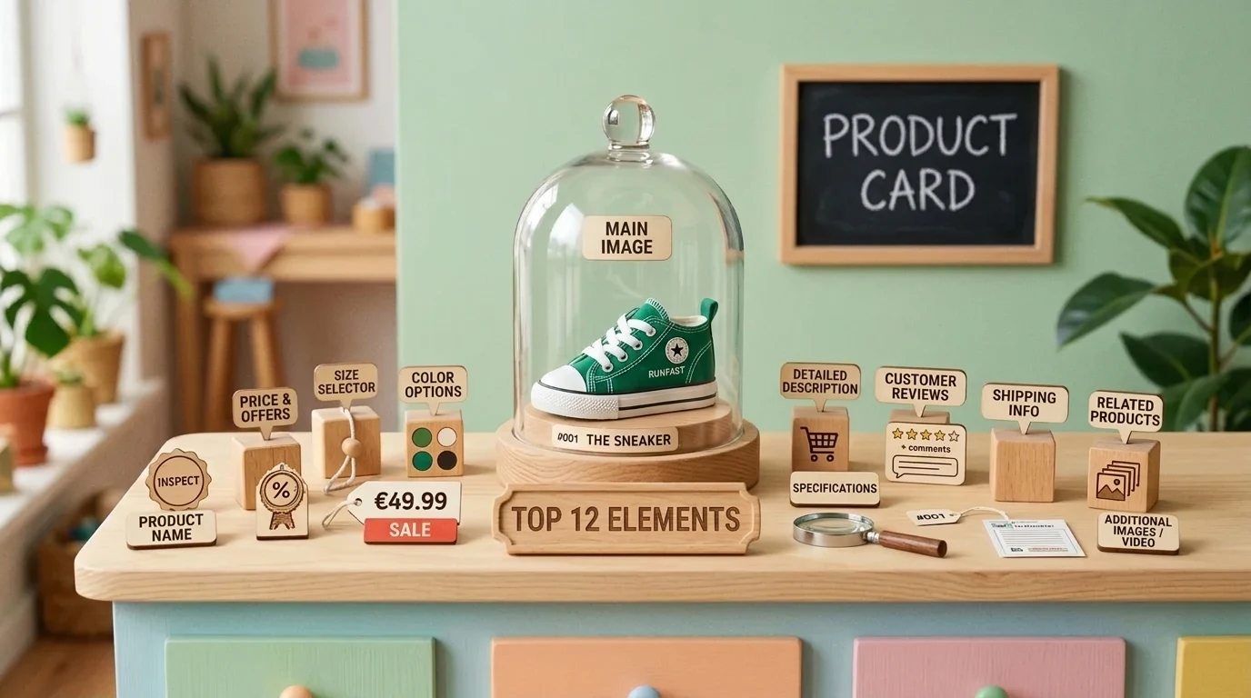
In 2026, an e-commerce product card requires not just good photos and reviews, but also structured data (Schema.org Product, Offer), 1-click mobile checkout, and rapid micro-caching to prevent visitors from leaving for competitors. Learn more in our e-commerce SEO section.
In an online store where quality e-commerce product descriptions attract shoppers, the product card is where the most important business event takes place: the visitor decides whether to become a buyer or leave for a competitor. Often, businesses invest thousands of euros in advertising and attract huge visitor traffic, but sales do not happen simply because the product page is unclear, incomplete, or raises doubts about delivery reliability. We have compiled the 12 most essential elements that a modern product card must have.
Key Takeaways
- Decision-making center: The product card is the main conversion spot in your e-commerce store; even minor friction reduction on this page directly increases sales volumes.
- Buy button above the fold: The purchase button, analyzed by user behavior and UX analytics, must always be visible on mobile devices without scrolling or feature a sticky button.
- Delivery and return transparency: Hidden shipping costs are the main reason for cart abandonment; exact delivery times and prices must be visible right next to the product price.
- Social trust signal: Customer reviews with real photos and secure payment guarantees remove the buyer's final doubts regarding financial security.
Top 12 Critical Elements for a Successful Product Card
Check your e-commerce store against this 12-point standard:
1. High-resolution multi-angle photo gallery: A buyer cannot pick up the product, so images must replace the sense of touch. You need at least 4 to 6 images: an overall view, a close-up of details, the product in a real usage environment, and a size scale against a familiar object.
2. Short product video overview: A 10 to 15 second dynamic video reel increases conversions by 25 to 30 percent by showing the material's drape, elasticity, and true appearance in motion.
3. Clear and precise product title: Avoid complex internal warehouse codes. The title should include a clear brand, model name, and main specification (such as material or volume).
4. Transparent pricing and savings: If an item is on discount, clearly display the old price (crossed out), the new price, and the actual savings in euros or percentages. B2B e-commerce stores should clearly indicate prices with and without VAT.
5. Real-time inventory availability: The phrase 'In stock (shipping today)' creates a sense of security, while 'Only 2 items left' creates a healthy sense of urgency.
6. Intuitive variant selection (sizes, colors): Color variants should be visual circles with real tone swatches rather than just a dropdown text menu. For clothing, a precise Size Guide is mandatory.
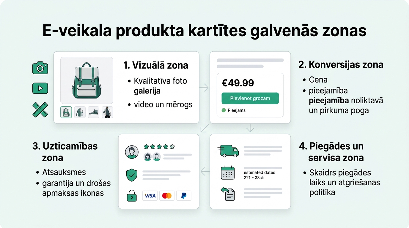
7. Contrasting and fixed purchase button (Sticky CTA): The 'Add to cart' button must be the brightest element on the page. On mobile devices, it should stick to the bottom of the screen while scrolling so a purchase can be made at any moment.
8. Instant delivery calculation: Right below the buy button, clearly display: 'Delivery via Omniva/DPD in 1-2 business days - €2.99 (Free from €50)'. This eliminates fear regarding unexpected costs at checkout.
9. Conveniently structured description (where multilingual content localization is useful for international buyers): Divide long text blocks into clear accordions or tabs: Description, Technical Parameters, Care Instructions, Manufacturer.
10. Verified buyer reviews with photographs: Real customer ratings and photos build more trust than professional marketing photos. Allow customers to share their experience.
11. Security and warranty badges: Clearly understood icons: '14-day return guarantee', '2-year official warranty', 'Secure payment via bank card and online banking'.
12. Thoughtful related products (Cross-sell / Up-sell): Offer accessories or complementary items that are genuinely useful alongside the main product (e.g., wax waterproofing for leather shoes), raising the average order value (AOV).
Mobile Interface Features: Where 70% of Shoppers Are Lost
More than 70% of e-commerce visits in Latvia happen from smartphones. However, many stores design their product cards for large monitors, forgetting about ergonomics:
| Element | Poor Practice on Mobile | Best Practice on Mobile |
|---|---|---|
| Buy Button | Must scroll 3 screens down to find the button | Floating button at bottom of screen (Sticky bar) |
| Image Swapping | Small imprecise thumbnails that are hard to tap | Fluid swiping with finger gestures |
| Size Selection | Small list blocking the screen | Large, easily clickable buttons with stock status |
| Loading Speed | Unoptimized 5MB images and slow LCP | WebP/AVIF format and loading under 1.5 seconds |
Conclusions for Successful E-Commerce Development
The product card is a sales instrument that requires thoughtful e-commerce SEO optimization (as we explained in our overview on what to choose - your own e-store or a sales platform). Every element on this page must either provide the buyer with the missing answer or remove trust doubts. By implementing these 12 core principles, you are guaranteed to notice an increase in conversions and a decrease in abandoned carts.
Frequently Asked Questions
What is the optimal product photo size for an e-commerce store?
The recommended size is 1200x1200px or 1600x1600px in a square format, saved in WebP format under 150-200 KB to ensure sharpness upon zoom and lightning-fast loading.
Is it worth showing 'Recent Purchases' pop-ups on the product card?
Only if they are genuine and unobtrusive. Fake or aggressive pop-ups annoy buyers and reduce trust in the brand.
How to organize review collection in a new e-store without history?
Offer your first buyers a small thank-you bonus (such as free shipping on their next purchase) in exchange for a detailed review with a photo.
How big of a role does highlighting the '14-day return' play?
Huge. Buyers are afraid that the product won't fit or they won't like it. A clearly visible and simple return process removes this psychological barrier.
Want to increase your online store sales and cart completion rates?
Request a 15-minute e-commerce audit call. We will discuss your product card UX, speed, and SEO visibility.
Fixed budget. No hidden extra fees or forced services.