

In 2024, B2B website content and form optimization focused primarily on reducing excess form fields. By 2026, the standard has shifted to immediate two-way communication: minimalist 2-3 field application forms combined with direct calendar booking and automated B2B assistants. Learn more in our B2B landing page development services.
In the B2B services sector, a website rarely acts as a direct cash register. Its primary task is to filter and attract qualified business leads, turning a cold visitor into a trusted partner. However, many company websites suffer from the 'engineer syndrome': they are packed with complex jargon, long texts, and tedious 10-field questionnaires that drive away even the most interested buyers. In this case study, we will examine how a systematic overhaul of content architecture and the simplification of the conversion funnel can significantly boost closed contacts.
Key Takeaways
- The Biggest B2B Mistake: Information Overload: B2B companies often try to say everything on a single page, burying business clients in technical details and hiding the core value proposition.
- Form Friction: Every additional input line in a form reduces the conversion rate by 8 to 15%. Transitioning from 9 to 3 essential fields more than doubles submission readiness.
- Above-the-Fold Trust Signals: Business decision-makers look for proof: industry certifications, clear collaboration steps, and real testimonials create an immediate sense of security.
- Thoughtful Thank You Page: The communication funnel does not end with 'Thank you, we will be in touch.' Explaining the immediate next step ensures the potential client does not open a competitor's page.
Starting Position and Problem Diagnosis
In a classic scenario, a B2B company invests heavily in advertising and SEO, receives steady traffic, but the number of inquiries remains minimal. User session recordings and heatmaps typically reveal three critical barriers:
1. Unclear Value Proposition in the Hero Section: Within the first 3 seconds, the visitor does not understand exactly what problem the company solves and why they should choose this specific solution.
2. Navigation Labyrinth: The most important service descriptions are hidden under generic titles across three-level menus.
3. Excessive Questionnaire Bureaucracy: To request a consultation, users are asked for a company registration number, employee count, exact budget, and detailed project description.
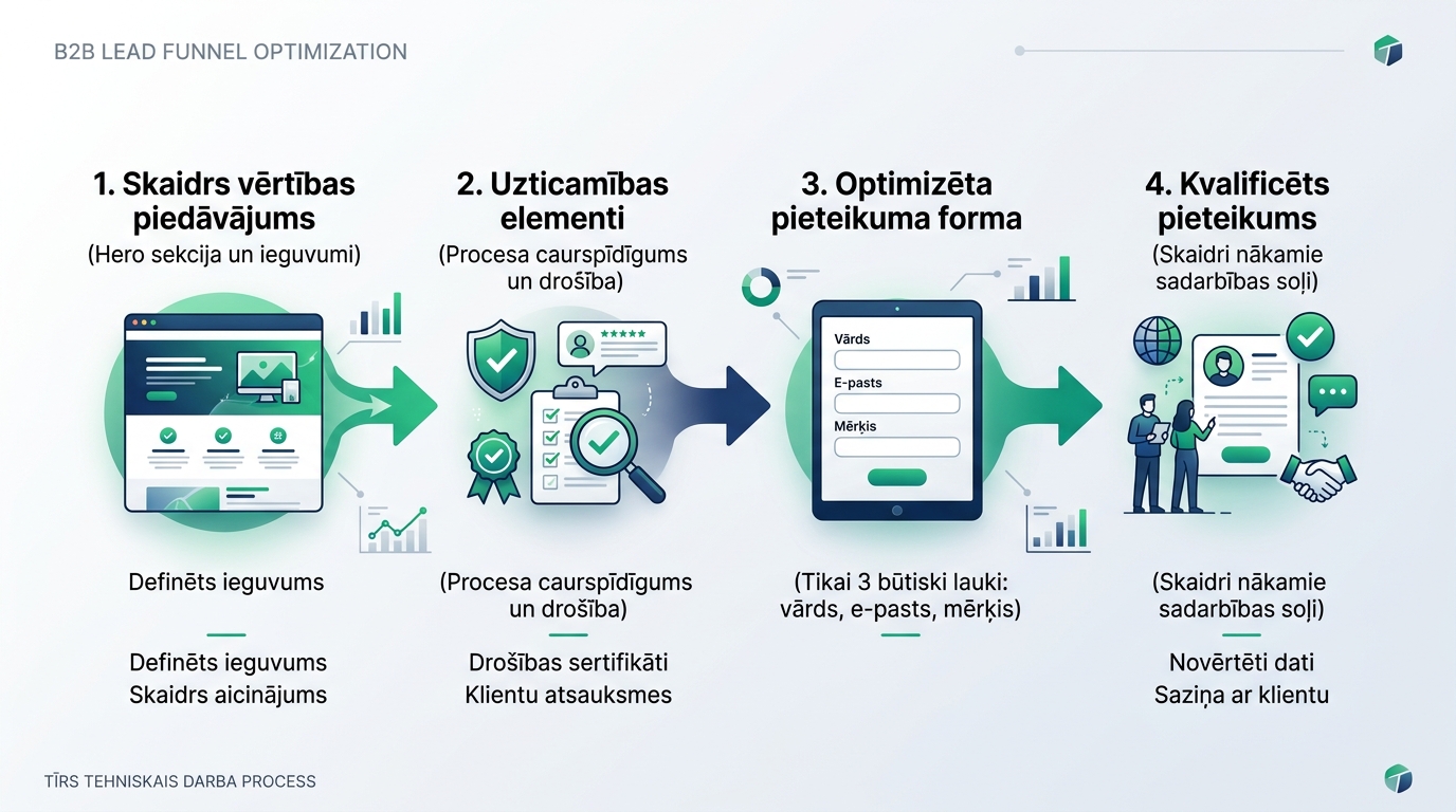
Four-Step Redesign Methodology
To transform the website into an effective sales tool, a structured approach was implemented:
| Optimization Stage | Before Changes | After Optimization | Achieved Result |
|---|---|---|---|
| Main Message (Hero) | Abstract slogan: 'Innovative digital solutions for your growth' | Concrete benefit: 'Business process automation and IT infrastructure audit with guaranteed results' | Instant clarity and bounce rate drop |
| Trust Block | Text testimonials without names at the very bottom of the page | Verified partner logos, certifications, and process right below the Hero | Higher level of trust above the fold |
| Contact Form | 9 mandatory fields, including budget selection and address | 3 essential fields: Name, Work Email, and Project Goal | 140% increase in form submissions |
| Next Step | Simple pop-up: 'Thank you, your message has been sent' | Thank You page with a calendar link for immediate 15-minute call booking | Qualified calls increase from day one |
This transformation perfectly illustrates how targeted landing page development built for a specific business audience works.
The Role of Text and Visual Balance in Building Trust
In the B2B sector, a buyer does not act on momentary emotion. They must report to management or partners regarding the chosen solution. Therefore, content must be logically grounded and structured:
Transparent Work Process: Clients are frightened by the unknown. By introducing a visual 4-step collaboration roadmap (Application -> Audit -> Solution -> Implementation), the client understands what happens after clicking the button.
Powerful Website Copy: Technical terms must be formulated through the prism of the client's business benefits. As explained in the article on how website copy builds sales power, clear language always defeats unnecessary complexity.
Behavioral Data Monitoring: Do not stop after the redesign. Regular user behavior analysis with scroll depth and click maps reveals new opportunities for further improvement. Similarly, as emphasized in the analysis of how website navigation structure and UX design shape the user experience, clarity is the foundation of any conversion.
Frequently Asked Questions
Does a 3-field form generate low-quality leads?
Quite the opposite. The initial task is to establish contact. Client qualification can be effectively carried out during the first short conversation or via an automated email questionnaire once trust has already been established.
How soon can you expect first results after form optimization?
Conversion growth is typically visible immediately after publishing the new form, provided the website has steady target audience traffic.
Does a corporate website mandatory need a price calculator?
Not always. However, a price guideline or at least a minimum project scope helps filter out clients whose budgets do not match your service level.
Conclusions
The purpose of a B2B website is not to impress with complexity, but to remove doubts and make communication with the company as easy as possible. By simplifying forms and refining the value proposition, a business gains a steady, predictable, and high-quality flow of clients.
Want a B2B website that turns visitors into real partnership inquiries?
Request a 15-minute conversation. We will review your site structure, buyer journey, and remove friction from your lead forms.
Fixed budget. No hidden extra fees or forced services.